AltaClaro
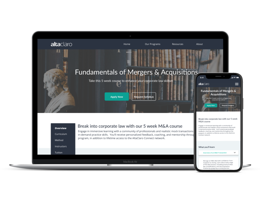
AltaClaro is an e-learning startup that provides corporate law training for law students and junior legal professionals (Think it as a UX Bootcamp but for legal professionals).
The Problem
Their current website lacked proper information architecture and brand identity as a result of low usability.
My Role
I collaborated with the CEO and the Head of Product. My responsibilities include conducting user research, ideation, wireframing, usability testing, and final visual design. The project was finished in six weeks.
The Outcome
A redesigned website that improved information architecture allowed users to find course information in under five seconds and increased usability by 40%.
Next Steps
1. Implement analytic tools to collect data on bounce rate, page view, and user flows to iterate on the products and improve conversion rate.
2. Expand the style guide into design systems.
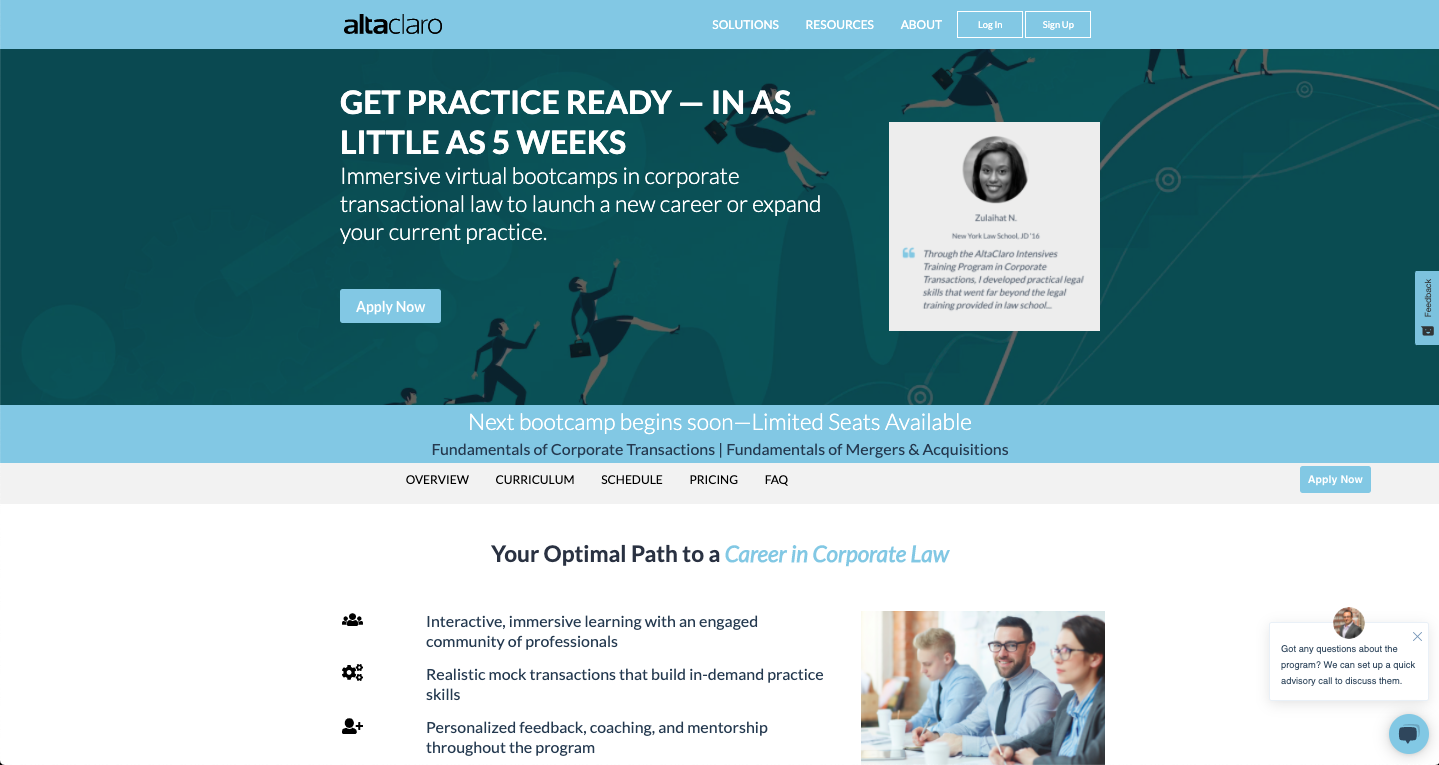
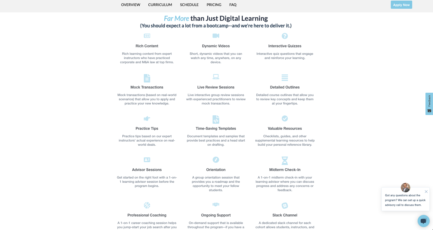
The Original Design
Heuristic Evaluation
Before I spoke with the client, I conducted a heuristic evaluation to identify the current website's pain points, which are missing essential information and poor information architecture.
User Interview & Card-Sorting
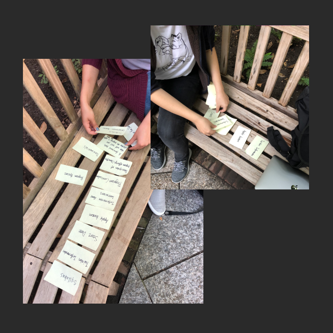
After a stakeholder interview, the objective was set to make the course discovery easier for the users and improve conversion. Without too much user data, I decided to conduct interviews and card-sorting exercises with the users. Those conversations helped me empathize with their needs for career advancement. The card-sorting data helped me to discover a better way to structure the website.
Opportunities
1. How might we improve the information architecture on the website?
2. How might we make the curriculum discovery easier for the users?
3. How might we make the unique offering stand out to the users?
Curriculum Discovery - Competitor Analysis
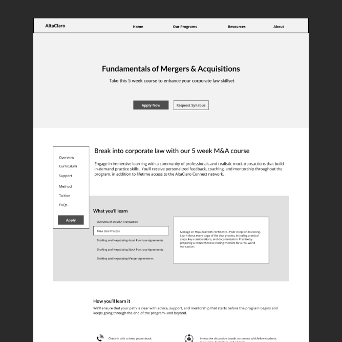
To find inspiration on displaying the curriculum, I did competitive research with other e-learning websites. I picked two versions and used them for rapid A/B testing to decide on a single version to move forward.
Wireframing & Usability Testing
Once I conceptualized the layout on paper, I used Figma as my primary wireframing and prototyping tool to iterate on the design. After gathering feedback from the usability testing, I created high-fidelity wireframes to make the design more concrete and endure the client and developer could picture the desired outcome.
Final Design
Individal Course Page
To avoid a long scrolling page and display the most important information, I decided to use cart-sorting data to structure this page (Curriculum, Course set up, Unique offerings, Instructors, Tuition fees, Starting date, and Testimonials). "What you will learn" was designed for an easy curriculum discovery, and "A community to guide you through" includes the unique offerings that stand out to the users.

Home Page
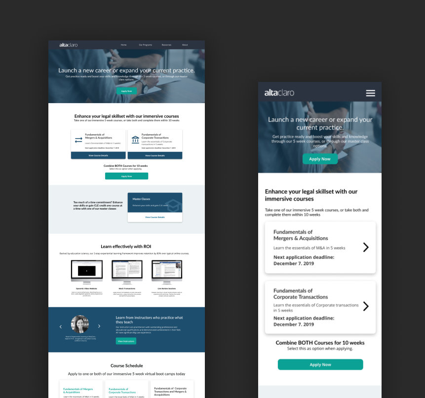
The landing page has clear CTAs, allow the users to apply and discover more detail about the courses. They can glance at the course set up (how are they going to learn) and instructors, and those are the top information the users care about based on user interview data.

Style Guide
STYLE GUIDE
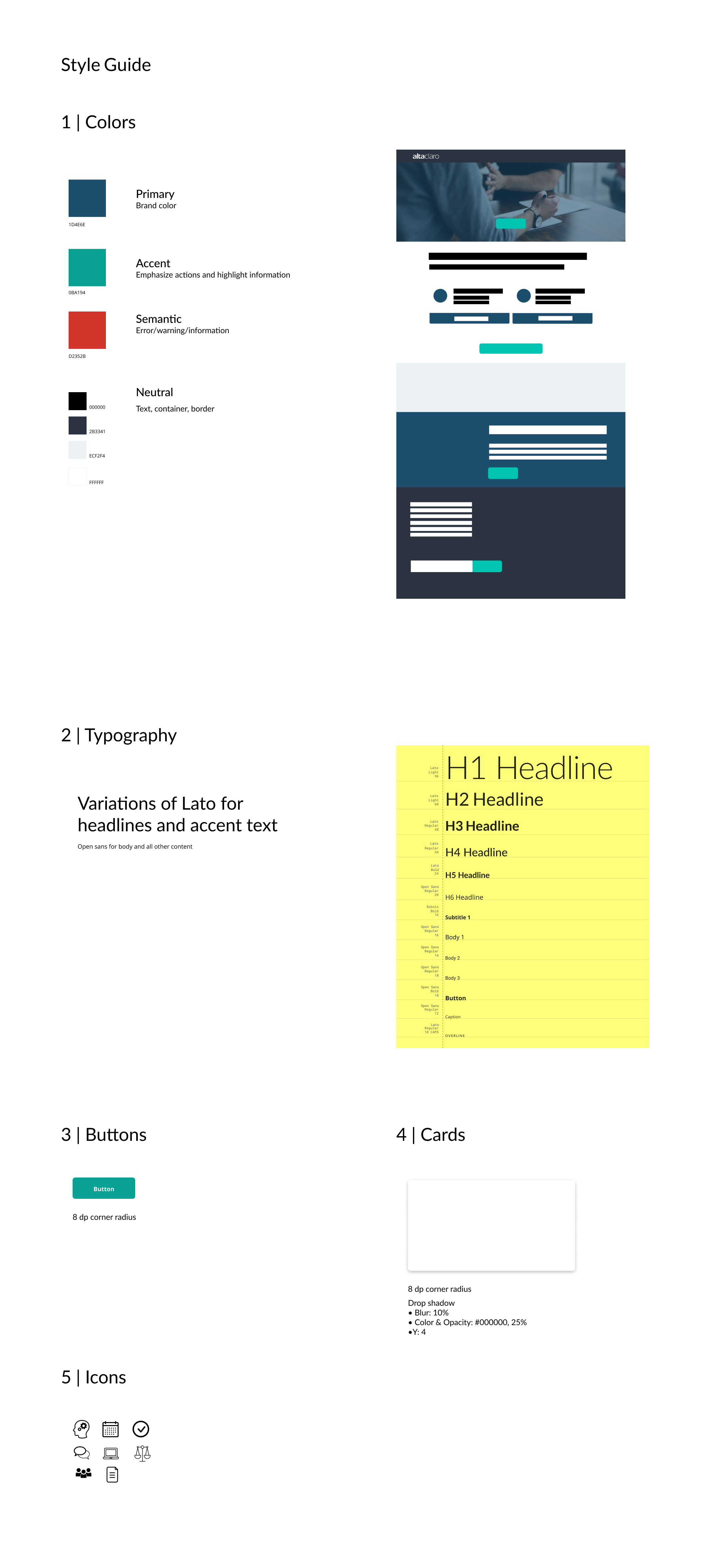
The style guide aims to improve the brand identity, design consistency, and design speed. The colors and typography were the outcomes of a collaboration with the client to deliver the brand message, which is trustworthy. The other components were developed at the sketch sessions.
